Design Systems Help Everyone

Smart organizations recognize the importance of having design systems in place. As part of product development, it allows teams to collaborate on larger and more important UX issues without having to focus on reinventing the wheel when handling UI issues. A design system is like a box of Lego blocks; each brick is a small piece that can be put together with other bricks to create new and wonderful things in a simplified and consistent manner. In other words, a design system is a library of reusable elements used in application and mobile, and website development that allows for easy and rapid prototyping. The pieces that make up the design system include brand fonts, colors, spacing, principles, iconography and all design aspects needed to create a cohesive user experience.
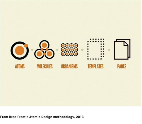
The individual UI elements of a design system can be described using a hierarchy, as illustrated below. Inspired by chemistry, the atomic design methodology helps layer how pieces are combined to create the product. Our understanding of this hierarchy begins with the most basic of HTML elements like form labels, inputs and buttons. These items can then be combined and grouped together to ultimately create a customized template to be used for content in a web page or application.

Design systems inspire collaboration because they enable cross-functional teams to work together. Developers should not have to be designers. Design systems allow them instead, to collaborate with designers to ensure the product is most optimal. Together, teams work to create the design system, starting with either an audit of current design elements or from scratch. Working collaboratively, they define the way elements should appear, behave and be connected. The design system pieces this together to create a library of reusable elements that will produce scalable digital products. Using the design system, teams can be assured that all brand standards and styles, responsive behaviors, and UI design patterns will remain consistent.
Feedback in the development project is easily and quickly obtained because elements already exist and have been agreed upon, they just need to be pieced together. This is not to say that things are unable to change and feedback is not necessary; feedback and collaboration are needed for design systems which should be constantly upgraded to meet rapidly evolving digital trends and user needs. Having a design system in place eases the process.
Design systems are crucial for programs like Google G-suite as well as Microsoft Office. There is a consistent user experience across each product in these software suites. Similar buttons can be found in both Excel and Word. Users learn the ‘undo’ button in one product and can easily find and understand the same button functionality in another. The creation of this ‘undo’ button clearly demonstrates the reason for a design system. This is advantageous for both users and the business creating such products. Users can easily adopt other products in the suite because they have familiarized themselves of how it works.
This also decreases time spent creating new products. Using our same example, when configuring all the buttons for Microsoft Excel, many remain the same as the ones already created for Microsoft Word. When new buttons are created for Excel, they can be added to the design system, which can then be used by other products in the suite, like Microsoft PowerPoint. It’s a simple process of reusing elements to remain consistent and on brand, which in turn, saves time and money.
Interested to learn how your company can start using design systems for its projects? Contact our experienced delivery team today.