Divergent vs. Convergent: Finding the Right Balance

User Experience (UX) is all about understanding their needs and providing solutions in the digital products we design. We lean on Design Thinking in our daily problem-solving work and in doing so, we employ both divergent and convergent thinking approaches to help guide our ideas and solutions in our design process. Our goal is to understand our users current state, identify any issues and frustrations, and to be able to prioritize these as items to solve give the limitations of time, resources, and/or budget constraints. In a simplified design approach, these steps can be defined as discovery, define, ideate, prototype, and delivery. Like the scientific method, we consider data to form a hypothesis to test and measure our results for success.
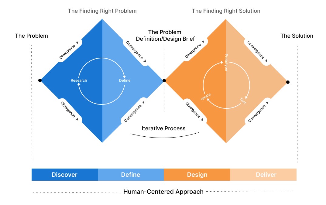
The image below known as the “double diamond” may be familiar to many. It illustrates the design process of widening our view to explore ideas and then narrowing them to allow us to focus on solutions.
Convergent vs Divergent Thinking
Both convergent and divergent thinking are cognitive approaches that work together to find innovative solutions to problem solving. The terms were first coined by psychologist J.P. Guildford in 1956. Convergent thinking is more efficient, linear, and systematic. Divergent thinking is more widespread and random. On one hand, convergent thinking will simplify and narrow down multiple ideas into a single solution. And on the other hand, divergent thinking will explore many options and find multiple creative ways to achieve our goal. Convergent thinking forces us to think through any clutter and focus on the single best solution, while divergent thinking is unstructured and asks us to consider multiple possibilities, even if some of those ideas may not end up working.
These may seem like two opposing ways of thinking that compete against each other. However, in UX we use both convergent and divergent thinking together in our design process. We will often begin using divergent thinking to generate lots of ideas, and then move to convergent thinking to analyze and narrow down ideas into viable solutions. Then, we will return to divergent thinking for new and alternative perspectives, and then back again to convergent thinking for focus, iteratively returning to this cycle as needed.
Convergent and Divergent Thinking in Practice
Imagine your laptop starts acting up. It has already crashed twice, and you have a presentation to give this week. Since time is of the essence, you immediately submit a service ticket to your IT department. Your waste-no-time thinking approach is an example of convergent thinker by employing a straightforward solution.
Now consider the same example, but this time you try to figure out the problem on your own. You open your system configuration, investigate any issues with running applications, and even try running some anti-virus apps. In this case, you’re using divergent thinking to explore multiple options and use creativity to find possible solutions.
The UX Development Journey
UX relies on both convergent and divergent thinking to arrive at good design solutions. As already stated above, both have their benefits, and we iterate on each in our UX design process. UX begins with empathy and so early-on, we try to understand our users. We rely heavily on divergent thinking to identify who they are and understand their needs, wants, frustrations, and goals. Once this foundational knowledge is obtained, we will use convergent thinking to focus on a single user and their task.
Or consider the design of an application where we utilize divergent thinking to explore and consider distinctive features and modules. Later, we will apply convergent thinking to create a focused timeline and process for collaboration with cross-functional teams and delivery. A mix of convergent and divergent thinking are both required to arrive at sound UX solutions at each phase of our UX design process.
Next, we will describe how each approach comes together at each step in the process.
Discovery
Typically, UX engagements begin with some type of discovery to understand our user and their needs. The ability to empathize with our users plays a crucial role. There is no cookie-cutter formula to accomplish this because every user, feature design, and project are unique. Utilizing design thinking, some questions we might ask at this stage include:
- What could create user reluctance to usage in our application or features?
- What steps do users take in the use of the application or feature?
- What creates delight for our users when using our application or features?
- What creates frustration for our users when using our application or features?
To obtain these answers, we typically create user personas from actual potential users. We develop personas by interviewing real people and collecting data on their preferences and behaviors. We can also create an empathy map from a user persona to show what a user says, thinks, feels, and does.
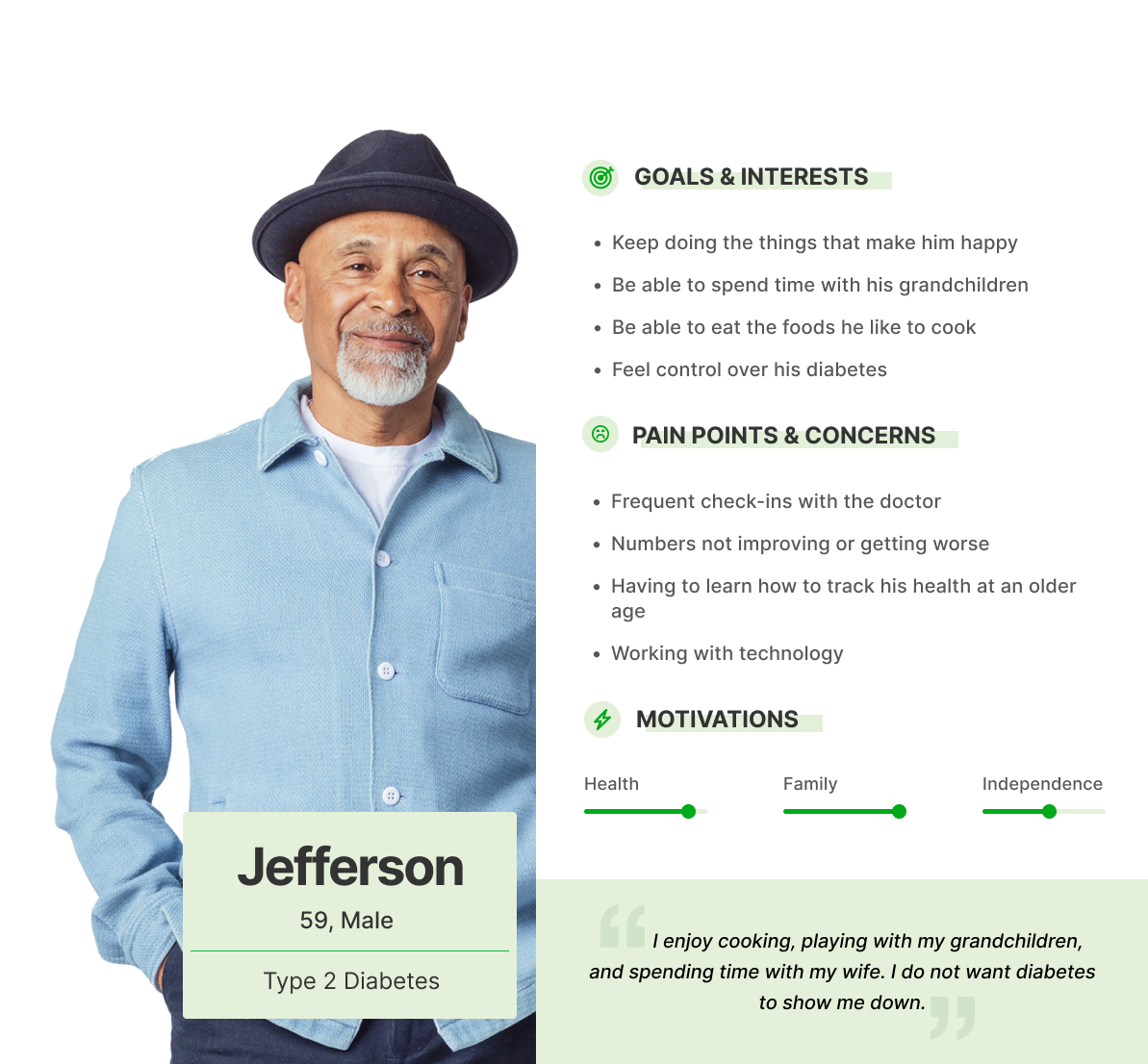
A persona, as demonstrated above, helps us understand real user needs, wants, and frustrations
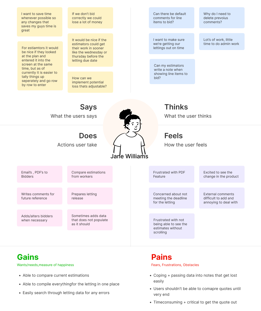
An empathy map, like the one shown above, highlights what a user says, thinks, does, and feels regarding an eCommerce application
Define
Upon completion of our UX discovery, our team can generate ideas to address user needs and frustrations. However, before moving to feature development, they must be defined in a language appropriate for our engineering colleagues. In the discovery stage, user actions and behaviors were identified and categorized to understand our user’s needs. UX goes beyond identifying the “what” and takes time to understand the “why.” In this stage, our research and data are synthesized to create an accurate picture of the problem. An actionable problem statement is developed that is focused and tells us what must be achieved for a successful solution for development.
A problem statement, also called a Point of View (POV), helps us identify the gap between the current state and the desired goal of a process, service, or product. A problem statement can be written from the users’ perspective, a research perspective, or in a format that answers critical questions about users and their actions.
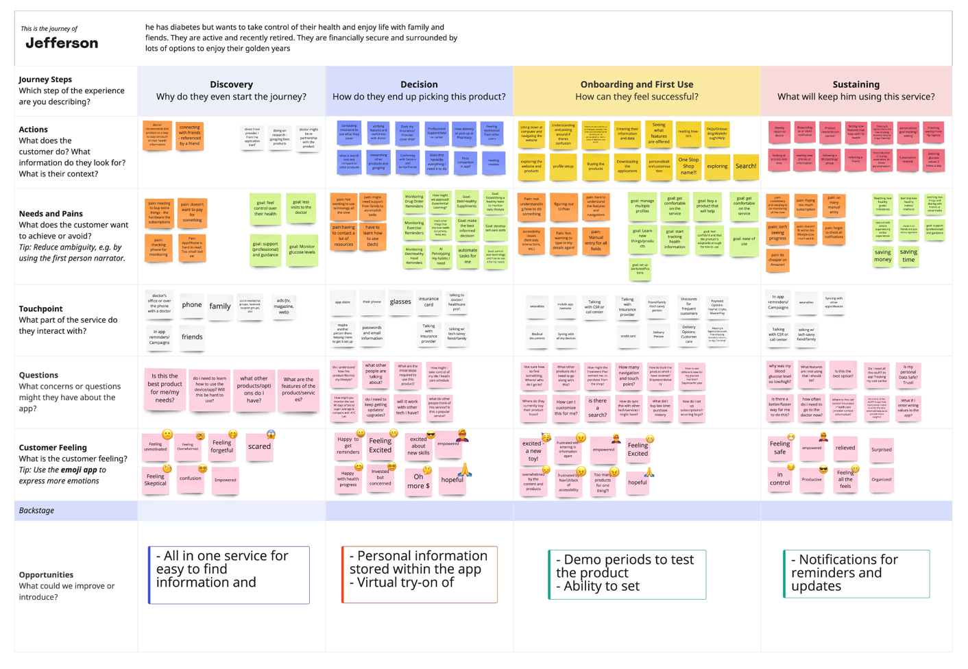
User journey maps a user’s interactions at various stages with task or application
For example, consider a smartwatch user. A problem statement from a user’s perspective would look like this:
“I am a busy professional and I am not getting enough time to exercise. I want to be healthier and understand if my physical movements are enough to keep me healthy. I feel frustrated when I don’t know where I stand and what I should do to maintain my health.”
Rewriting this from a research perspective, the problem statement would become:
“Busy working professionals need an easy way to track one’s movements to stay healthy because they do not have time to dedicate to exercises and want to stay healthy with minimal movements.”
Finally, writing it in a format that answers questions about the user, the problem statement would look like this:
“A working professional is struggling to take time for exercise as work keeps them busy. We should deliver an easy way to track movements of the person and encourage physical activity to achieve desired fitness goals.”
Ideate
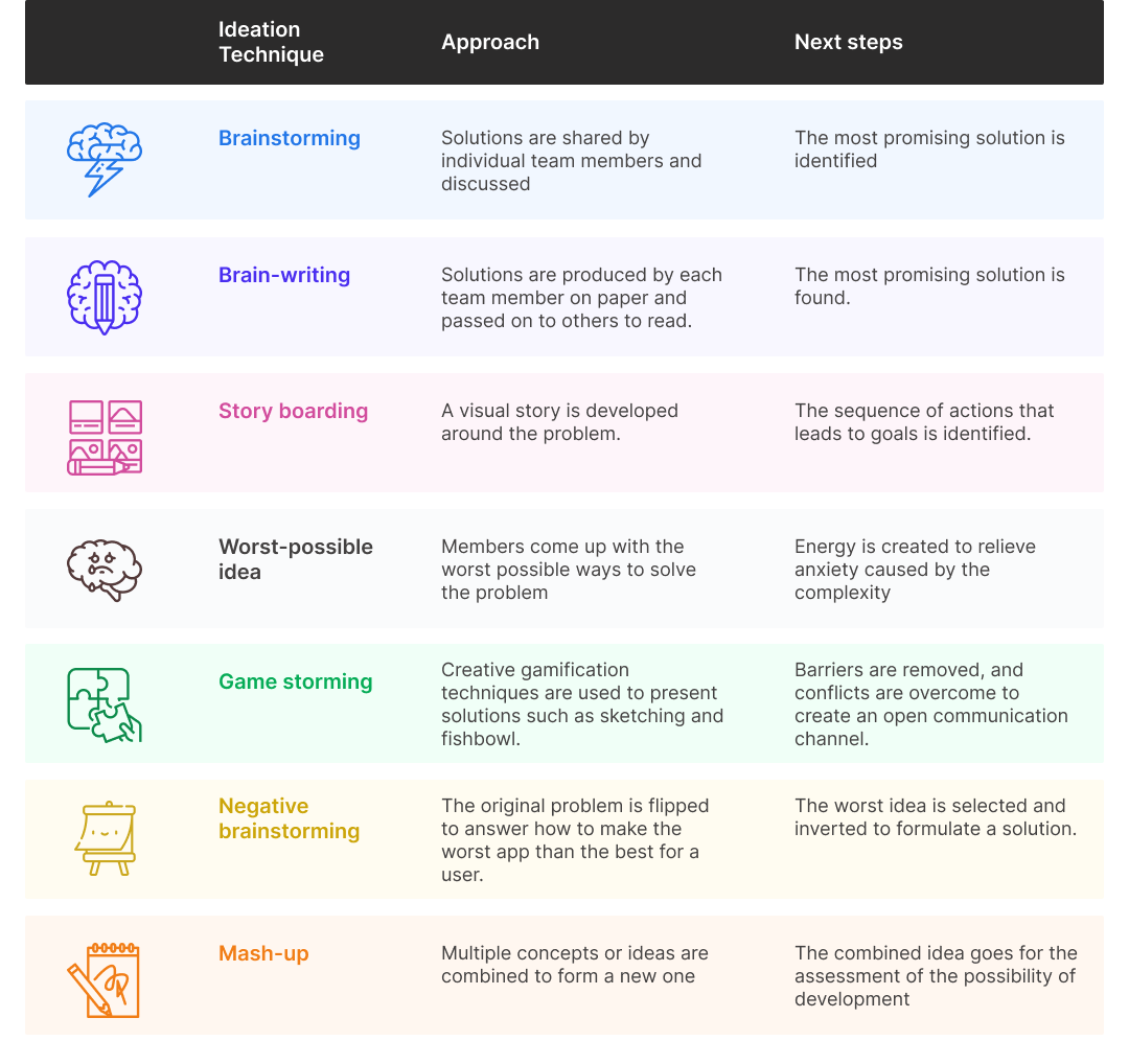
So far, we have talked about understanding user issues and creating a problem statement. Next, we take steps towards a solution and identify ways to solve their issues. There are many ideation techniques available to formulate solutions such as brainstorming, SCAMPER, and storyboarding. The table below describes these are a few more:
Prototype
We create early models of the features or products to demonstrate functionality to stakeholders and validate our designs. The design fidelity of our prototypes varies depending on who we are presenting to and the answers we seek.
Fidelity refers to how closely our designs match up with the look and feel of the finished designed feature or application. A low-fidelity (lo-fi) prototype has minimal or no interactivity and is less refined. In some cases, simple lines and shapes can suffice to create a wireframe solution to test critical elements like information architecture and navigation features. Increasing fidelity to produce a high-fidelity (hi-fi) mock-up adds color, content, animations, and interactions to take the prototype to the next level and closer to the final designs.
During early ideation with internal team members, a simple sketch on paper can suffice to build understanding and confirmation of ideas. However, if we are presenting designs to client stakeholders or our end users, we may have to elevate the fidelity and interactivity of designs to validate solutions or sign-off. Regardless of the level of fidelity or interaction, prototypes are valuable tools to validate solutions before moving into development, which can be time consuming and expensive.
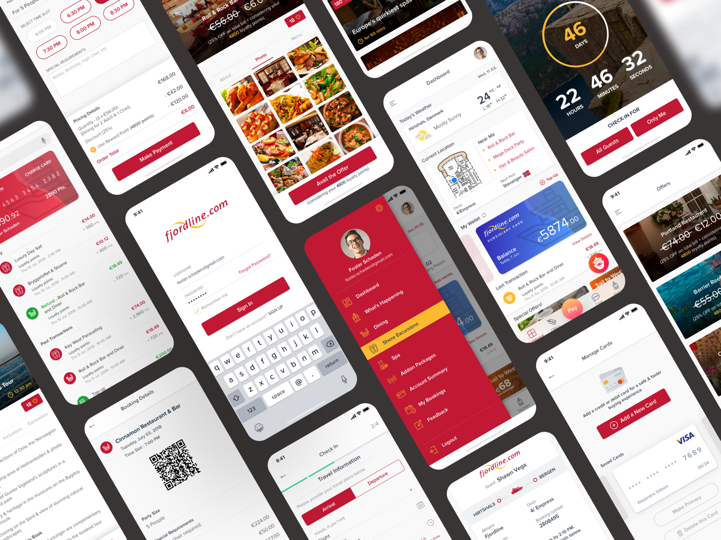
High-fidelity visual design examples for a cruise line mobile application
Delivery
Once designs have been validated, only then can we say that a product or feature is ready to be we can move into production and delivered to users. Additional user testing with prototypes and working code can be done to further understand how various conditions impact the use of an application or feature and our users’ feelings and behaviors when using it. Findings from user testing are feed into our iterative stages of development to refine and optimize our solutions.
As a product team, we move from convergent thinking to divergent thinking iteratively. User experience research and design is not a cookie-cutter approach, and it is important to collaborate with a mix of cross-functional teams with different experiences and perspectives. Together, as a team we contribute to the overall success of the development of features and products.
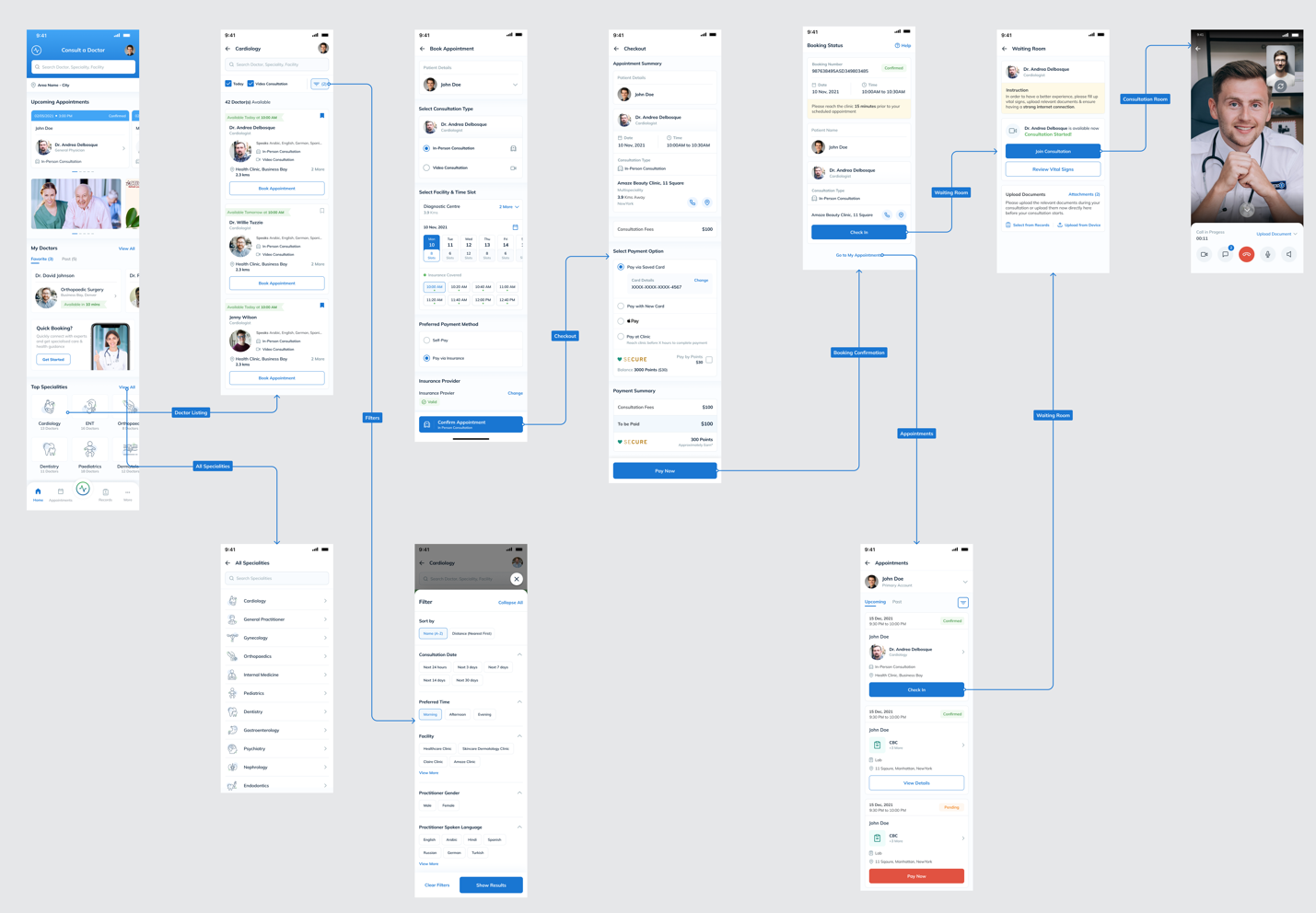
An Interactive prototype for a healthcare mobile application showing the various linked pages
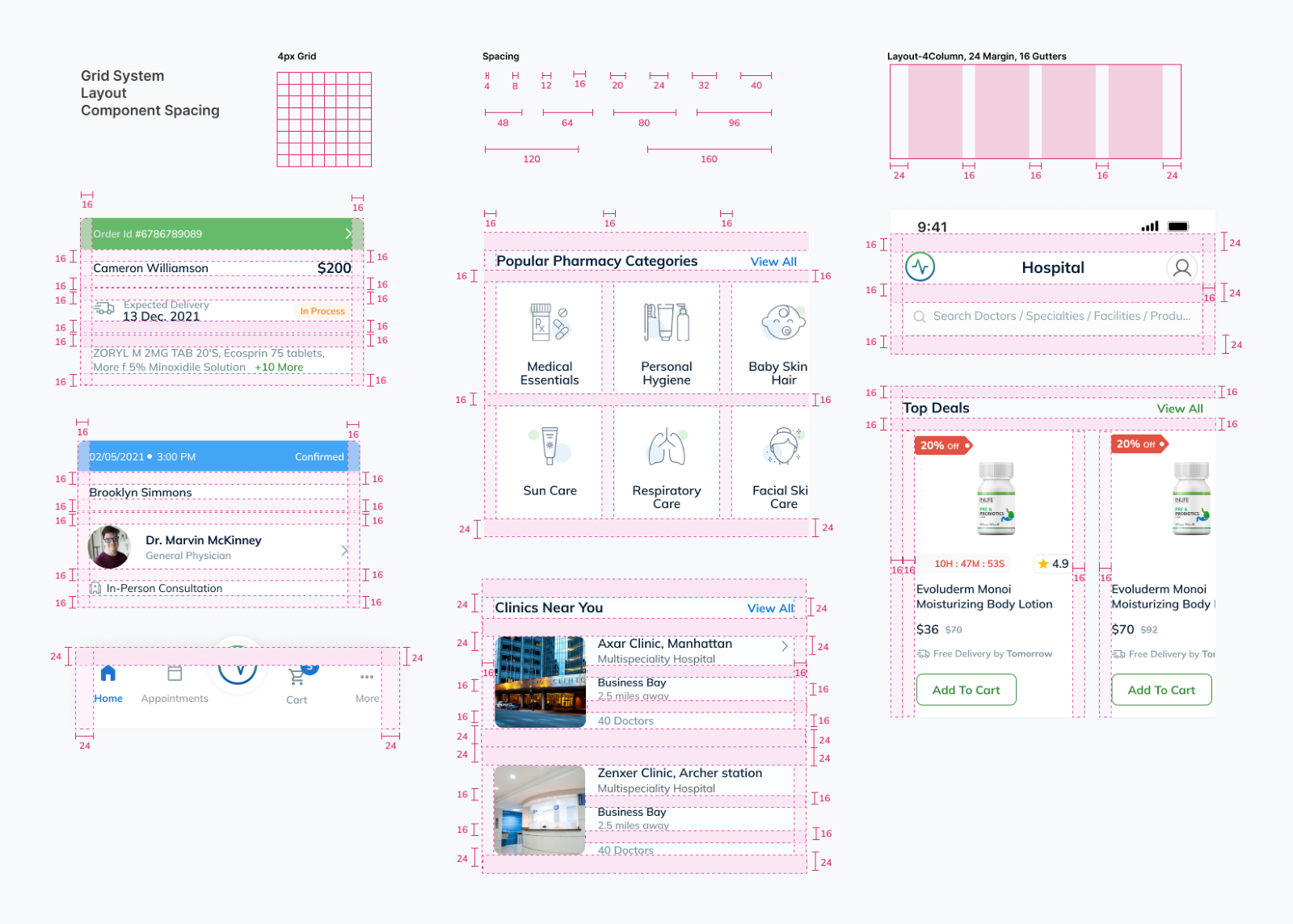
An example of developer handoff specification guide
Divergent and Convergent: A Perfectly Designed pair
When you think about divergent and convergent, you might imagine two different ways of thinking competing against each other. But in reality, these two styles are complementary and can be used together to create an exceptional UX design. From the designer perspective, these two approaches challenge us to think in different ways to arrive at a cohesive and confident conclusion.
Through the UX development journey, we first leverage divergent thinking to empathize with our users. Convergent thinking comes into play to help us develop a plan of design attack. Combined, divergent and convergent thinking are a perfectly designed pair.
To learn more about turning your digital touchpoints into a competitive advantage, check out Apexon’s UX Strategy and Design services or get in touch using the form below.
