Insurance Company Collects $800,000 in Additional Premiums Through Website Redesign

The Brief
The insurance industry is highly competitive, driven by providing an exemplary digital customer experience. Successful carriers make it as simple as possible for customers to go online and get a new quote, and then purchase a policy of their choosing. When Apexon client, one of the fastest-growing insurance companies in the U.S., noticed that a large portion of their web traffic was leaving in the middle of the checkout process, they reached out for help.
The Challenge
The client’s Digital Optimization team had a good idea of where they saw a large number of drop offs from their DIG app. The number of users who dropped off during the checkout process of purchasing their policy was particularly concerning. The Digital Optimization team noticed that users often begin the checkout process after receiving an agreeable quote, but exit the application shortly before they pay for it. This resulted in missed revenue, which highlighted the need to take a good look at the existing UI for this part of the application to see what might have caused this drop off.
The Solution
It was decided that a complete redesign of the process would be the best way to improve user conversion. The redesign would include an overhaul of the policy review page, payment method page, and the sign up page. Next, the client’s designers needed a front end React developer to bring their solution to life in order to test their theory.
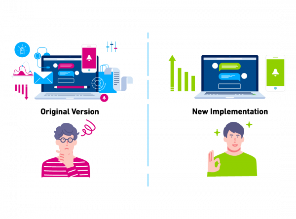
Apexon’s developers were able to create new components in their existing code base that would be used in the variant pages. Optimizely, the client’s digital experience platform of choice, comes into play by splitting the traffic of users into two groups. One group would see the original version of the checkout process while the other group would see the newly implemented checkout process. Furthermore, metrics were added to the experiment on Optimizely to track user conversions through each page of the checkout process.

The results
Increased user conversions by over 8% in just one month
This equated to more than $800,000 in additional premiums. The success of this experiment was attributed to identifying the need for a design overhaul, the creation of new designs for about three pages of the application, the implementation of those designs through React development, and the metric tracking through Optimizely.
Partnership Platforms/Software


