The UX of Unified Commerce

Retailers know that to truly resonate with their customers they need to connect with them on the Web, mobile, tablet, and more and more via voice using smart speakers. We created the Gho Now Grocery Store as a proof-of-concept to demonstrate the power and capabilities of unified commerce. We understood the technical and data requirements needed, but more importantly, our design thinking approach to user experience (UX) meant that we could showcase the benefits and the true value of a unified commerce for our clients and their customers. In this article, we’ll discuss the unique advantages that UX provided in building a unified commerce solution.
“As customers move through the shopping ecosystem, unified commerce places them and their unique shopping experience at the center of the delivery model, so retailers can focus on a common omnichannel experience and react appropriately.”
According to Boston Retail Partners, 81% of retailers plan to offer unified commerce by the end of 2020! Before diving in too deep, it is important to understand what unified commerce is. Innovation in retail has evolved from a single e-commerce presence, for example, the store website or mobile app, to an omnichannel approach using various digital channels. Today, we have arrived at unified commerce. This evolution in retail happened because new methods were needed to improve customer experiences and ways retailers can respond to them. Regardless of how customers interact with the retailer, digitally or in-store, the view of inventory, payment, and delivery should not vary or depend on the technology in use. From the customer perspective, it shouldn’t matter.
From a technology perspective, unified commerce is the delivery of a single commerce platform that eliminates any data and technical redundancies. So, regardless of how customers are connecting with the retailer, be it the web, mobile devices, voice-controlled smart speakers, IoT devices, or the merchant point-of-sale, all processes are aware of a single source of data in real-time. There is no need for data interpretation or syncing required since all customer touch points are referencing the same single connected source in real time. This allows an understanding of the end-to-end customer journey and all associated touch points. As customers move through the shopping ecosystem, unified commerce places them and their unique shopping experience at the center of the delivery model, so retailers can focus on a common omnichannel experience and react appropriately.
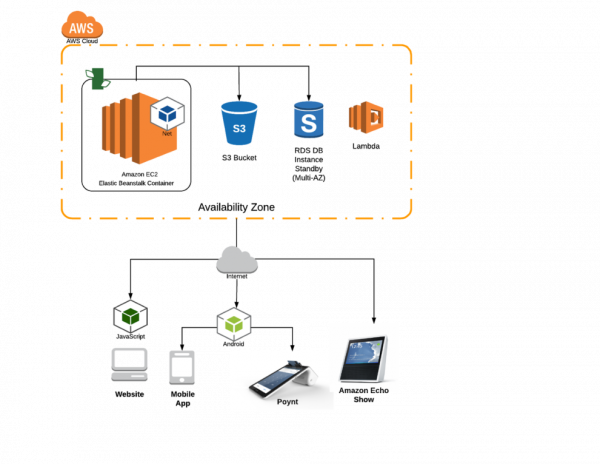
We deployed our sample grocery store on AWS and made it available to multiple devices, including a responsive website, a mobile app, an Alexa skill, and the Poynt MPoS. We then built an API to allow common services, including the ability to create profiles and set payment and pick-up/delivery methods, add/modify/delete shopping carts, and complete transactions.
Before we decided on a unified commerce model, we explored many potential candidates to demonstrate how unified commerce disrupts the common user experience. We landed on a grocery store idea that allowed us to map a typical shopping experience at a grocery store. By focusing on this single vertical, we could consider how shopping for everyday grocery items might be improved through a unified commerce lens.
Although a trip to the grocery store might be enjoyable to some, a majority of shoppers find it to be unproductive and boring. Finding parking, roaming through aisles in search of products, standing in check-out lines, and transporting items from the store, to bags, and back home is not usually at the top of the most-enjoyable-things-to-do list.
We started with an understanding of the user journey to determine user motivations, aspirations, and challenges, all the while asking, “How does shopping for groceries fit into the lives of our users?”
Our story begins with a day in the life of a family looking forward to Friday DIY pizza night. Dad’s at work and goes to his favorite browser. Once he connects to the Gho Now Grocery website, he creates a pizza shopping list and adds spicy Italian sausage and pepperoni.
Mom’s on the train and connects via the mobile app. She likes veggies, so she adds tomatoes, mushrooms, and green peppers. Then she moves the shopping list into the cart. The app recognizes she’s on the move and based on her current location sees that there’s a nearby Gho Now Store. Even though it’s not one of the “favorite” store locations set, the app asks if she would like to check-out and pick-up the items at this store? Mom knows that the kids haven’t had their say, so it’s not the time to check-out just yet.
When the kids arrive home from school, they’re excited about adding their favorites toppings too. They take turns talking to Alexa and the Gho Now Grocery skill.
Kids: “Alexa, open the Gho Now Grocery Store”
Alexa: “Welcome back to the Gho Now Grocery Store. You have an existing shopping cart. Would you like to review your cart items or are you ready to check-out?”
Kids: “Sure, let’s review the order”
Alexa: “Ok. Here is your current shopping cart: 1lb spicy Italian sausage. 1 8oz package of thick cut pepperoni. 2 green peppers. 16 oz package sliced mushrooms. 2 ripe Roma tomatoes….Would you like to modify items or are you ready to check out?
Kids: “Add a can of pineapple chunks”
Alexa: “Ok. 1 16 oz can of pineapple chunks has been added to your shopping cart…Are you ready to check-out?”
Kids: “Yes”
Alexa: “Ok, to complete your order and send to your favorite Gho Now Grocery Store on Green Street, say ‘check out from Green Street’. Otherwise, you can say ‘Check out from another store’”
Kids: Check out from Green Street”
Alexa: “Ok, your order has been completed and paid for using your digital wallet. It is ready for pick-up at the Gho Now Grocery Store on Green Street….Would you like to start a new shopping list?”
The kids know that Dad’s on his way home and can pick up the pizza party items. In fact, the alert has already been sent to Dads mobile phone, along with the confirmation QR code on his Gho Now Grocery app.
Dad’s on his way and makes a quick pit stop at the Gho Now Grocery Store on Green Street, just a few blocks from home. He sees the alert from the Gho Now app that his items are ready to be picked-up. Dad walks over to the “Gho Now Go” customer service center and simply presents the QR code sent to his app to the Gho Now Grocery mPoS device. His items are ready and Dad’s on his way!
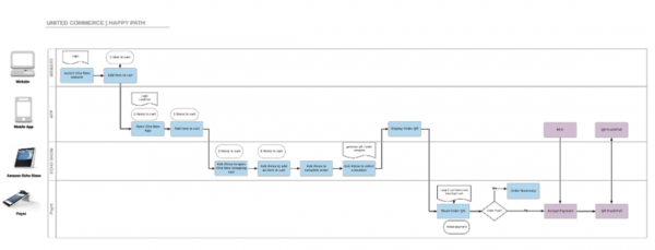
Although we defined this “happy path”, we needed to consider all device entry points and combinations used. For example, all tasks needed to be accomplished using a single device. Also, the scenario described above needed to begin from different devices. In terms of functionality, we had to ensure that all services were available to the user, independent of the device. Since we built our services from a single commerce platform, we’re guaranteed to have our services across channels and our view of data will always be synced in real-time. Unified commerce simplifies the technology needs of customers across multiple channels.
Our biggest challenge was building a simple, engaging and personal experience across various devices. Graphical user interfaces (GUIs) for the web and mobile are visual representations that depend on standards that users are accustomed to navigating. For example, they can easily recognize design conventions used to represent menu options or buttons.
As UX professionals, visual cues like color, size, and space convey an understanding of the content and dictate user interactivity. Voice, on the other hand, relies on a more natural human-computer interaction. It is conversational and allows for multiple ways for users to express meaning and intent.
Consider our initial welcome to customers. A GUI’s information architecture establishes customer’s understanding of the site and how to navigate it. On both desktop and mobile, we use a co-existinghierarchy design pattern to give users a lay of the land, defining content buckets that rely on tried and true UX standards and best practices. In a co-existing hierarchy IA pattern, we establish our main page, or homepage, with links to subpages, creating a child-parent relationship. However, unlike a strict hierarchy IA pattern, our child pages are also accessible from multiple parent pages. In other words, not just from our homepage.
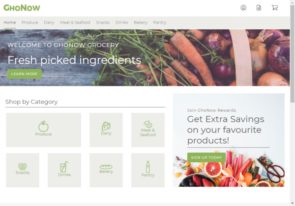
With additional real-estate, desktop users also see promotional content and alternate ways to navigate grocery categories.
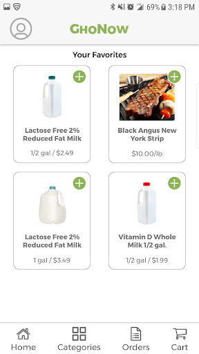
Mobile users have the same options available as well, but with limited space, we have consolidated personalization and promotional content under icons and menus. Instead, a quick list of most commonly purchased items greats our users. A persistent footer menu gives users quick access to orders and check-out.
Without any visual queues, our voice-command skill needed to be friendly and relatable to users. Information flows between participants and our skill using multi-turn dialogs so that users can provide information in ways that are most appropriate to them. In other words, we can’t simply present the same canned response every time. Instead, our voice UI converses with users to cooperatively carry the interactivity forward.
Our standard greeting upon launch is always to welcome the user. Then, depending on where the user might be in the shopping experience, offer an appropriate response. For example, if there is no pending shopping cart, we can guide users to start with, “To begin adding items to your shopping cart, just say ‘Add item.’’’
In our “happy path” example, a pending cart was immediately recognized and our response enabled quick and easy conversion.
Improved customer experiences and simplified technology are not the only benefits of a unified commerce platform. A single commerce platform can drive multiple benefits like enabling retailers to focus on customer service and enhancing the customer experience at all possible touchpoints. Unified commerce also makes it possible to provide options for starting and completing the shopping journey from any device or place. So buying online and picking up in store, buying online and returning in-store, buying in-store and delivering at home, or any other combination is all possible. A simplified single-source technology solution builds a foundation for essential customer response, wherever needed from any device.
Has your organization embraced unified commerce? Please share your thoughts and outcomes. Of course, if you interested in learning more about how UX is innovating unified commerce, we would love to hear from you too!
Read more: The Usefulness of Implementing Voice Technology in Apps
