Ultimate Tips On How Mobile UX Can Boost The Conversion Rates

UX is a modern-day pantheon of brand loyalty. Hence, it is crucial to digital transformation endeavours. It helps enhance the efficacy of digital operations. Three primary reasons why CX marks the focal point for digital transformations are next. Let’s learn how Mobile UX Can boost the conversion rates
Productivity
The goal of UX is to enable users to perform tasks with minimal effort. In this way, an efficient Mobile-based Middleware Architecture is deemed integral for creating highly productive apps. Take the instance of the Android Java Framework (AJF). A primary issue is that the design and implementation constructs for components get imposed to interact with one another.
The pertinent question is, ‘what background process gets tied to the UI?’ Is the process a long-lasting one? Also, can the process get affected by the activity’s lifecycle? Does the process get shared by multiple components? Going ahead, it becomes integral to implement Handlers, Service Connections, an interface that monitors the state of the Service. Another aspect is Messengers, catering to message-based communication across processes. Yet another is the intents, essentially abstract descriptions of operations to be performed.
One way is to leverage cross-platform (hybrid) frameworks based on web technologies, including HTML and CSS. These render support to scripting languages such as JavaScript, or Angular, for instance, Facebook ReactNative.
Operational Excellence
Bottlenecks through bureaucracy have been the arch nemesis for innovation. Not anymore! Thanks to remote and hybrid work processes, the call for a mobile architecture that works seamlessly across the globe is almost imperative. In line with this, mobile UX helps with on-demand collaboration while filling skill gaps to ensure timely delivery and efficiency.
Security
UX makes it easier for employees to follow the best security practices. One way is to make it easy for users to access accounts through single sign-on. Another is where Android and iOS ask developers to explain why an app accesses sensitive data. Typically, this gets done via a purpose string or a “user description”. For instance, the ‘Camera’ would like to use your current location. Even Uber deploys a similar tactic to access user location. A paramount concern is that mobile apps tend to access a great deal of sensitive and confidential information.
The battle between Mobile and Desktop Users
Today, desktop computers are not the only available medium. More people are graduating toward mobile devices for browsing, eCommerce transactions and other online activities.
As per BroadBandSearch, a Research firm, web traffic from mobile users stood at 51.3 per cent in 2016. In 2019, it rose to 53 per cent. The study also found that mobile users spent 90 per cent of their time using mobile-dedicated applications. Also, in 2020, about 58 per cent of the total multi-device purchases used mobile devices.
How is user behavior changing in 2022?
Customer centricity is here to stay! A focus on the short-term is detrimental and pyrrhic even. The need of the hour is for marketers to adapt and actively focus on brand building.
Let’s take the instance of HealthifyMe, a mobile app that intends to encourage people to stay fit. Pursuing a healthier lifestyle is no easy feat. It calls for sheer motivation, persistence and a lot of effort. In psychological terms, Sapiens get motivated by intrinsic (enjoyment) and extrinsic (rewards) factors.

The app can provide badges and milestones when select tasks get completed. Alternatively, it can enable users to compare their progress with their peers, Hashtag – Hustle culture.
The reward incites excitement! Once removed, it dissociates users from the enthusiasm they initially experienced while performing the activity. This gets often termed the “overjustification” effect.
A crucial aspect of the reward system is user-centric design through customisations. If the users perceive that the app caters to their individual needs, they are more likely to subscribe. The reason is that each user has a different objective.
Google’s move to a mobile-first experience
The mobile-first experience involves using the mobile version of the content or website for indexing and ranking. This aspect reiterates that websites must be mobile-friendly. Mobile friendliness itself is a ranking factor.
The other ranking factors are next.
Publishing High-quality Content
Content reigns as king, and it should provide valuable information to visitors. Also, keywords are incredibly crucial and serve as roadmaps for content creation.
Enhancing Page Experience
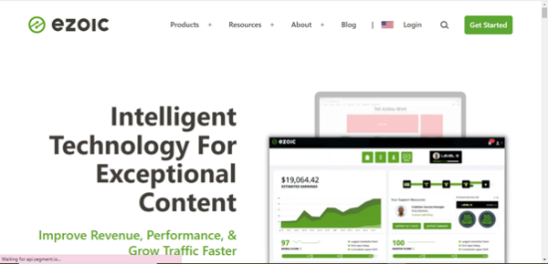
UX considerably impacts page experience. For instance, Ezoic saw a 186 per cent increase in earnings per 1000 visitors after improving its UX. A crucial component of page experience is site architecture.

Say that an app sends a network request to a remote service. In doing so, Android modifies the user interface and handles input events from a single thread (the primary one). In this way, the tasks that occupy it for any significant period cause the UI to become unresponsive. Another instance is where a user intends to check his account via mobile. The architecture has to readjust to the mobile screen size. In this way, it delays the loading time for the app and can become unresponsive. This is where responsive or dynamic architecture comes to the rescue.
On-page optimisation
A close confidante to page experience, on-page optimisation caters to the “backstage” of content and SEO. Among the many facets, it includes metadata and snippets. A newer content-related SEO factor is Google Discover.
Internal Link Structure
This helps users and search engines efficiently locate pages. For instance, a robust internal link structure makes it convenient for online users to navigate different pages.
Mobile design is strikingly different, and not just because of the size. The physicality and specifications of mobile devices lend themselves to unique design affordances and requirements. Another aspect is portability.
The information architecture patterns, too, differ for mobile devices. The native apps, for instance, often employ tab-based navigational structures. And one such pattern is the Hub & Spoke. The pattern renders a central index which enables users to navigate out. Note that Hub & Spoke is the default pattern on Apple’s iPhone. In terms of utility, this pattern is excellent for multi-functional tools, wherein each has distinct internal navigation and purpose.
Hub & Spoke deploys a single central screen that enables the user to explore different sections or spokes of the app. Shifting from one spoke to another happens through a hub. This mechanism helps minimise the on-screen noise. It is ideal for apps riddled with task execution and presentation of voluminous content.
External Links
Links will lead the pack of SEO components! They add credibility to your website and render a better ranking in the SERPs.
Local
Geotargeting is becoming ever more prevalent today. Website localisation thrives upon three ranking factors – relevance, distance and prominence.
How is your mobile UX affecting conversions?
UX is the overarching factor that impacts everything – your leads, visitors and customer experiences. Even more challenging is mobile UX, owing to the smaller screen size. Another daunting aspect is that websites have a lot of text.
Some tips to boost conversion rates
CTA Placements
CTA or Call-To-Actions are a testament to conversions as either deal-makers or deal-breakers. CTA placement shall determine how easy or difficult it is for users to download a voucher, subscribe to newsletters, or even make a purchase.
One way is to display the CTA at the top of the page. Doing so ensures that people see it and read it. Another is using a sticky header. It is a fixed element at the top of the site, remaining affixed as visitors scroll down the page. Yet another way is to create a pop-up bar or note with your CTA.
Minimise loading time
The rationale is straightforward! The longer it takes for the eCommerce website to load, the higher the chances of your brand losing visitors and revenue. Walmart found that a one-second improvement in page loading time helped to increased the conversions by 2 per cent. Websites can get tested with the four phenomena mentioned below.
Average Speed Index – Entails how quickly content appears on the mobile page. The lower the index, the better. Experts recommend keeping it under 3 seconds.
Average Time to First Byte – It caters to the responsiveness of a mobile web server. According to Google, it should be under 1.3 seconds. Some factors that impact this are network issues, dynamic content and server configuration.
Average Request Count – It involves the number of individual pieces that make the entire content. Experts recommend keeping it under 50.
Average Page Weight Bytes – It is the total size of the mobile page, measured in bytes. Ideally, it should be less than 500 KB.
There are several tools for testing these phenomena. Chief among them are Google Test my Site and Google PageSpeed Insights.
Navigation
Undeniably, navigation is crucial to conversions. Poor navigation creates confusion and roadblocks for visitors, conspiring to high bounce rates.
One way is to have specific categories and subcategories, especially for multiproduct and diverse sites. An example is Build.com. Other aspects can include clear product labels and product recommendation blocks. Also, brands should consider enabling filtered navigation. It helps with product browsing and elevates the overall navigation experience.

Website Readability
Website readability thrives upon legibility and comprehension. However, in the context of a webpage, the meaning slightly differs. Readability for websites includes font size, text colour, subheadings and sentence length.
It is a measurable quality, and tools such as Yoast SEO analyse web content and transform readability into an equation. One way is breaking down the text into bold headings and bullet lists.
E-wallet payment method enabled
Given the rise in mobile internet usage, a mobile wallet is another method that merits consideration for fulfilling online transactions. This tool replaces the use of physical cards and enables transacting via smartphones. Samsung Pay and Apple Pay are the prevalent avenues.
Small forms
Forms enable interactivity and offer valuable customer data and insights. They also help businesses with lead generation. One way of making it easier is embracing the Single sign-on (SSO) mechanism. Users can log in once and access other applications without re-entering credentials.
Say that a user uses the desktop to fill out a form. They will do so using their registered email address which can get accessed through other devices, such as mobile phones. Given this interconnectivity, the form information can also get picked up from other digital touchpoints where the user mentioned the email address. SSO makes it simpler for users to access other applications and eliminates the need to remember usernames and passwords.
At the end of the day
Mobile access is here to stay! Those who haven’t must jump on the bandwagon to optimise their websites for mobile devices. The business ecosystem is hyper-competitive and intense, and time is of the essence. May the force be with the smartest, reiterating the adage, ‘survival of the fittest’.
In line with this, the modus operandi at Apexon is to blend human intent with business intelligence. The result cascades into actionable data and real-time communication, contributing to stellar mobile UX.
Contact us today.


